Next Level Responsive Websites
What is Responsive Web Design (RWD)?
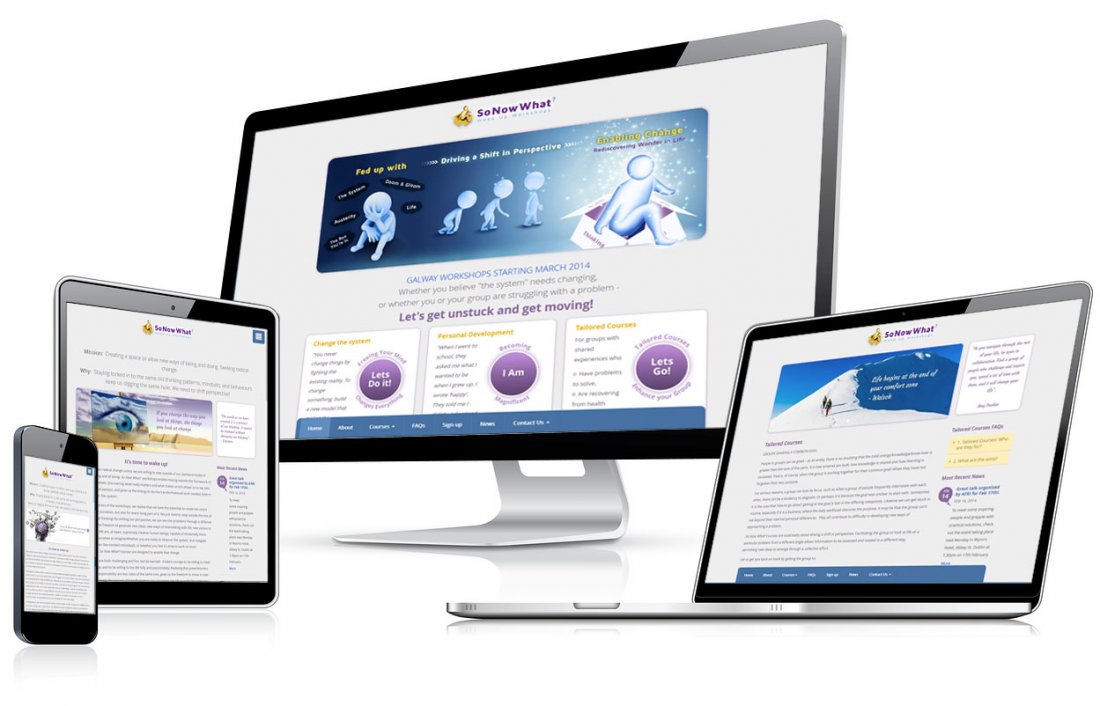
Responsive Web Design (RWD) is the latest in cutting edge web design. Responsive Web Design is an approach to web development that creates 'device level' changes on-the-fly, to the appearance of a website, depending on the screen size and orientation of the browsing device (PC, Smartphone, Tablet, TV etc) being used to view it.

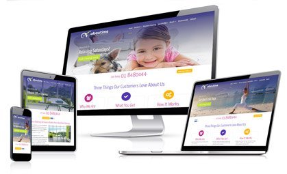
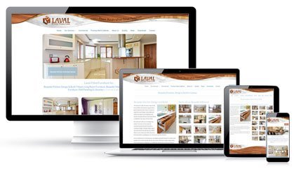
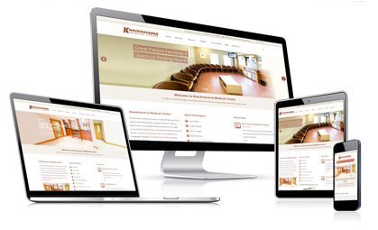
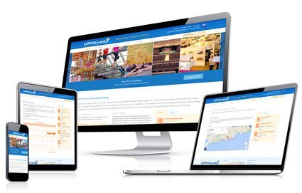
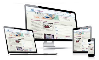
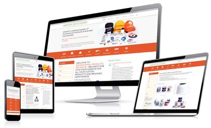
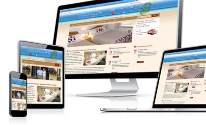
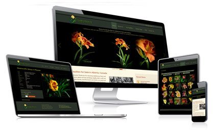
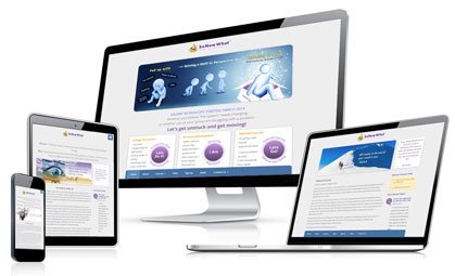
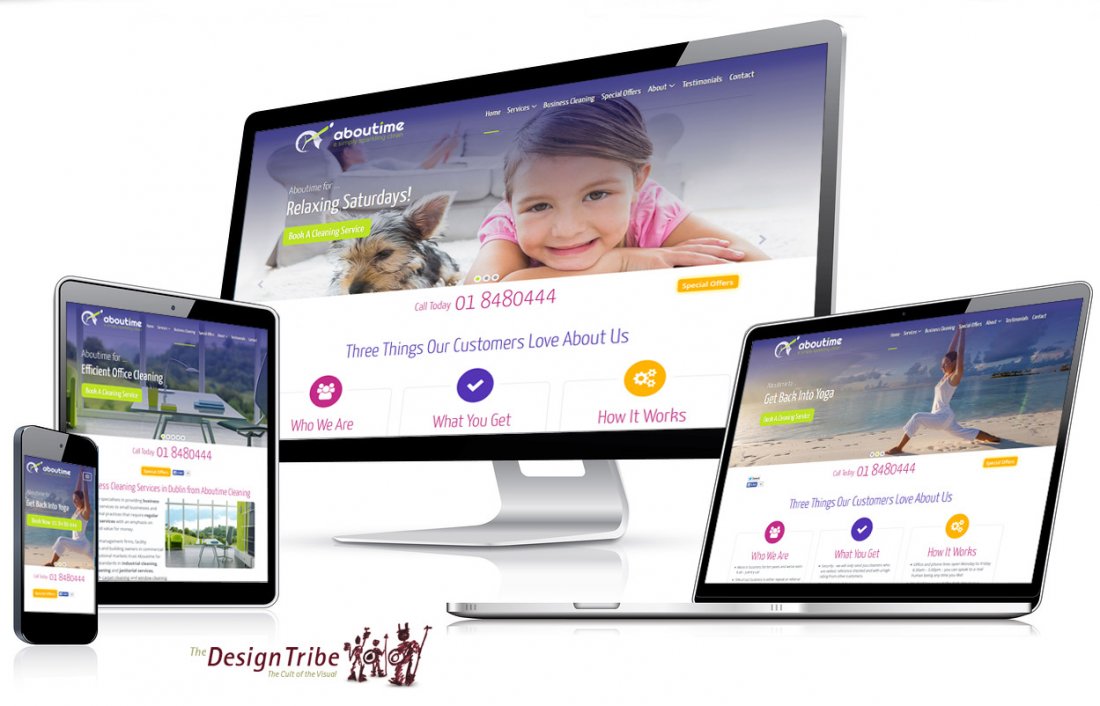
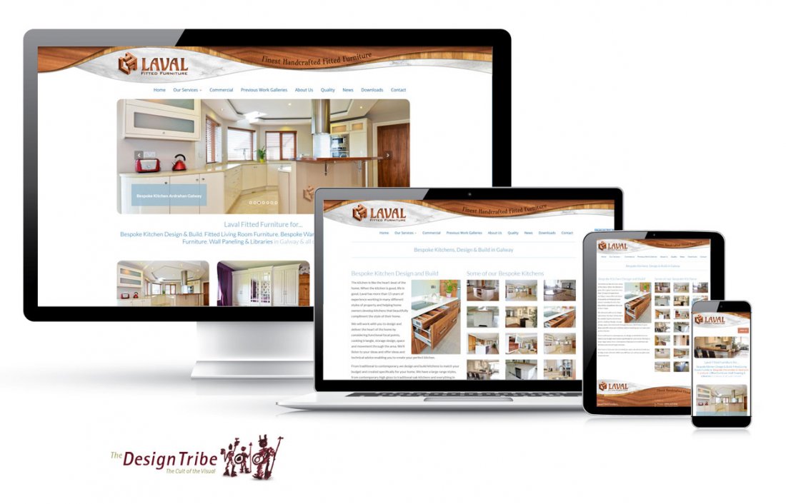
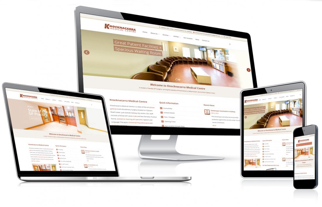
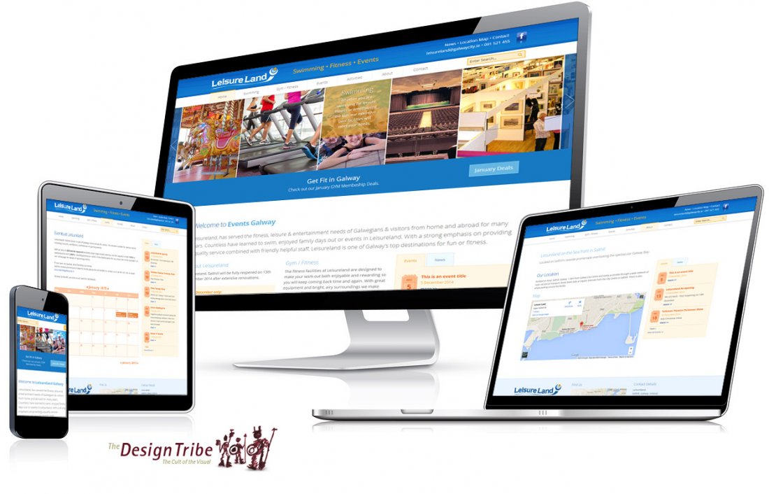
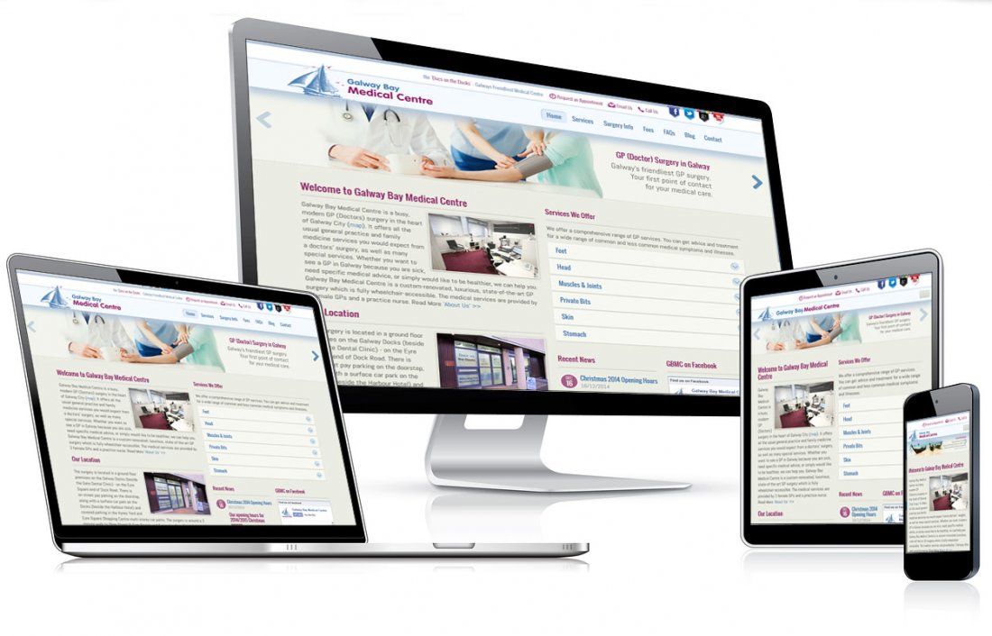
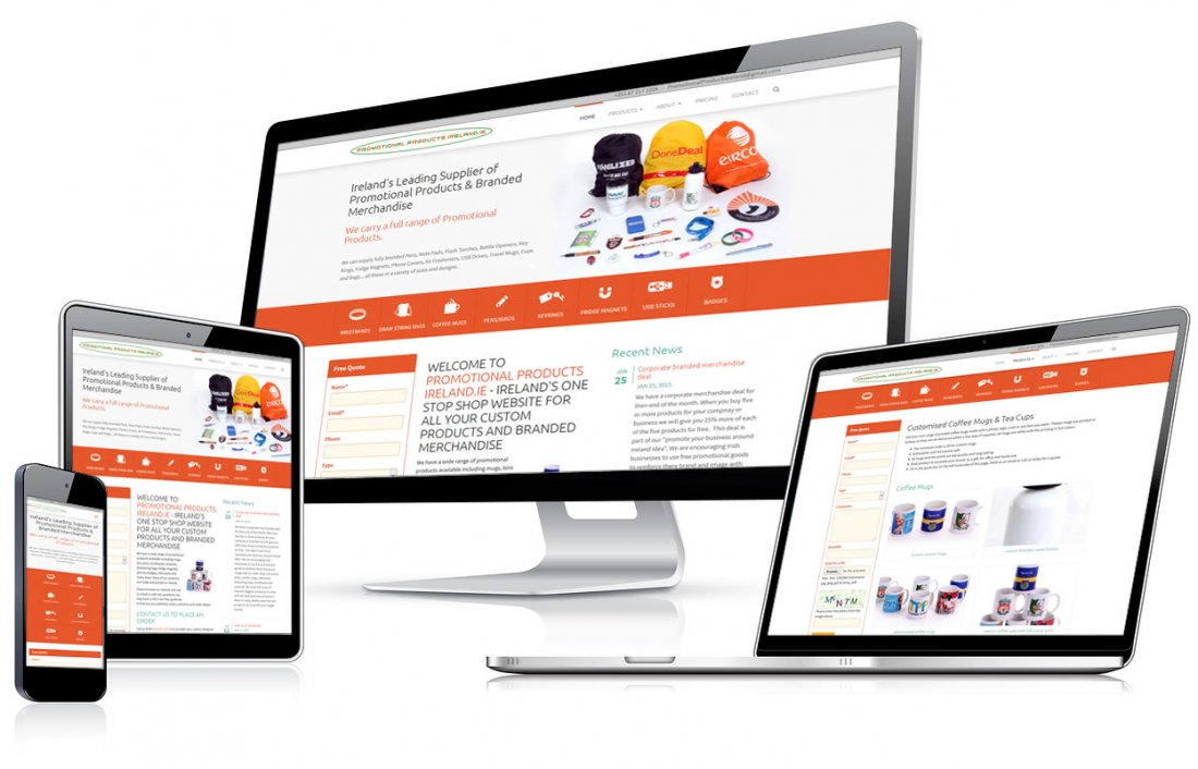
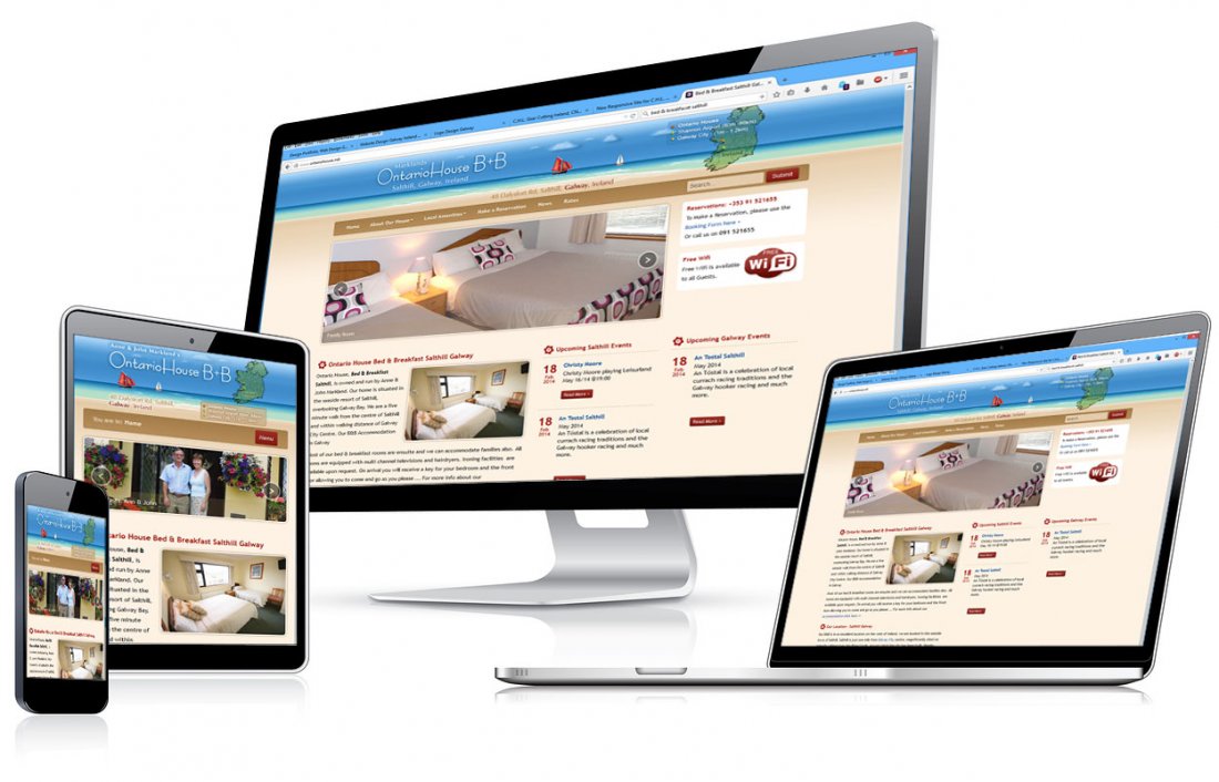
The amount of devices, smartphones and web browsers that your website needs to work on continues to expand, your website has to look great on all these screen types. We build these type of 'Next Level Responsive Websites'. Please check our portfolio of responsive design or contact us to see what we can do for you.
The Irish Telecoms Regulator (Comreg) reported that Smartphone penetration reached a record 59% of the Irish mobile subscriber market in the second quarter of 2014.
With 60% of mobile users, 'mobile broadband' users, it is now important that your site is optimised for these mobile devices.... as for many people, the 'mobile web' is their only or primary experience of the internet. (search engine optimisation in the smartphone era).
Responsive Web Design (RWD) can answer this challenge.
Responsive Web Design (RWD) represents a shift in how we build websites. Instead of building and maintaining multiple interfaces and content sets for a range of devices, a responsive website delivers the optimum viewing experience across all device types. As screen sizes continue to change, it's important that your site can adapt to any screen size. With RWD, at most, minimal changes may be required for each novel new device type as they are introduced into the future. But for the most part, your website will work on any device it is viewed on.
How does Responsive design do this?
In a responsive design, page elements may reorganise as the screen (the 'viewport') grows or shrinks. For example: a three column desktop design may reorganise to a two column layout for a tablet and a single column layout for a smartphone. Or a menu system may change depending on the device being used. This is done with flexible (fluid) grid layouts and CSS media queries. CSS media queries are filters that can be applied to CSS styles. They make it possible to change styles based on the characteristics of the device rendering the content.
We build these type of 'Next Level Responsive Websites'. Please check our portfolio of responsive design or contact us to see what we can do for you.